I was tasked to create a logo for the new business, ResourcesKE. Its aim is to create learning and development resources for business organisation to enhance employees professional capabilities employee's professional capabilities, knowledge and skills in the evolving markets and ensure business strategies implementation.
Initial Sketches
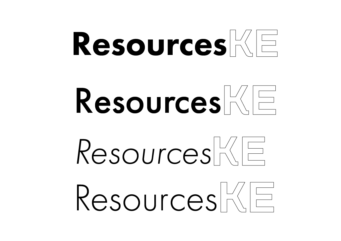
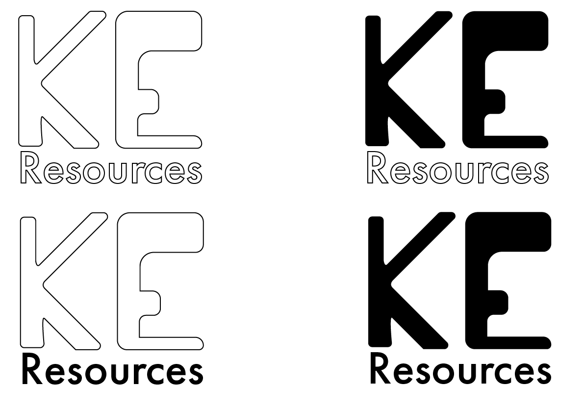
I started writing out the name of the logo onto Adobe Illustrator and started using simple fonts and the versions of said font. I wanted to emphasise the 'KE' and therefore, changing the font to something more bold and stands out from the rest of the word.
I experimented with the thickness of the word 'Resources' and whether the word shall be in italic. After some experimentation I decided to go with the font Futura medium as I believe its the perfect in between.
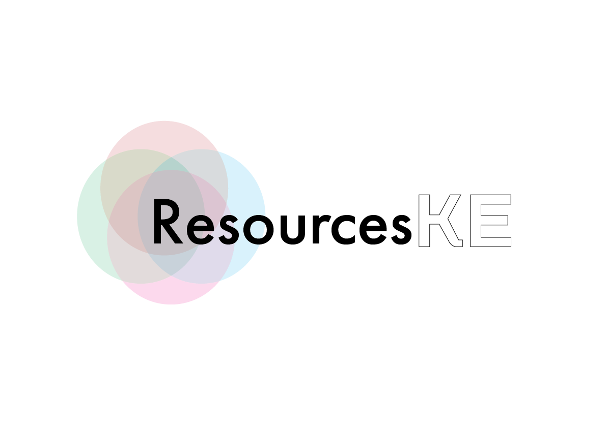
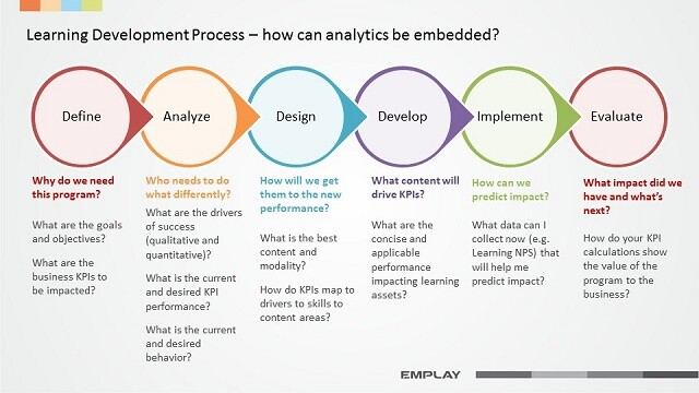
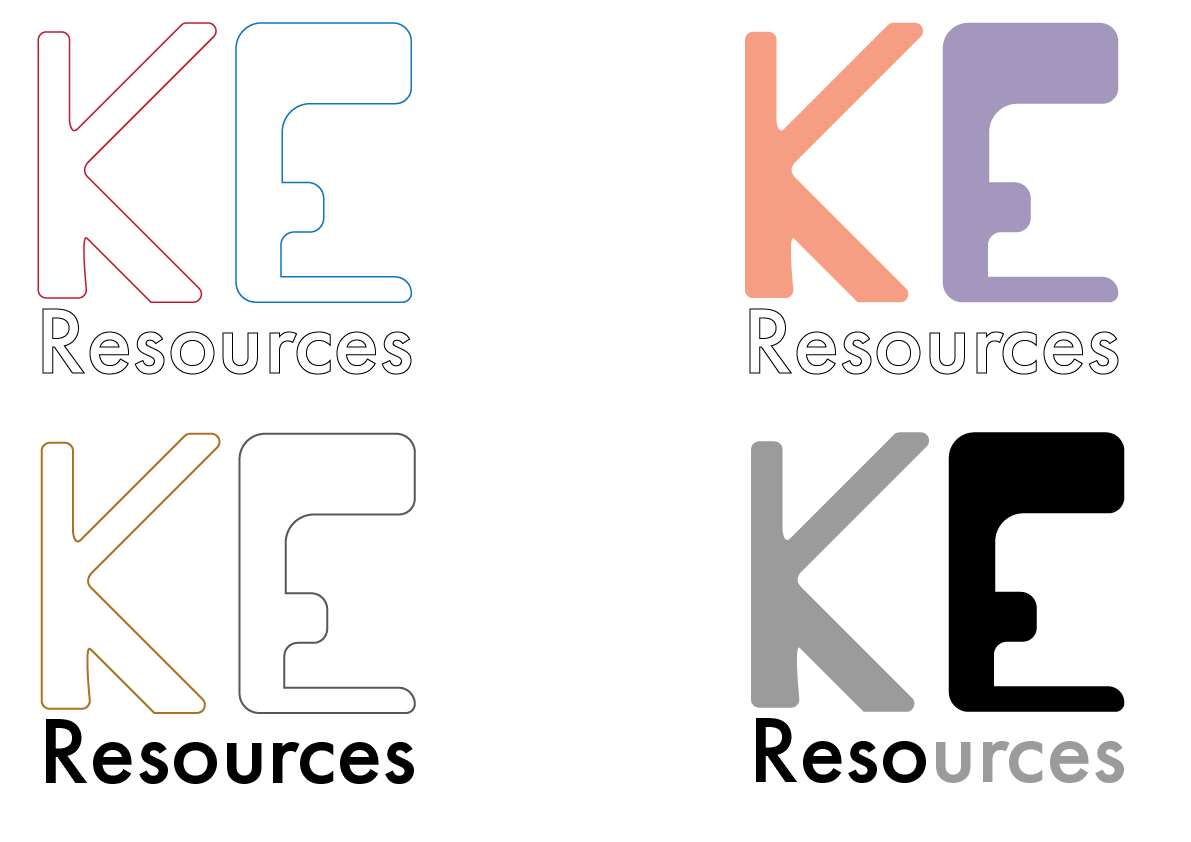
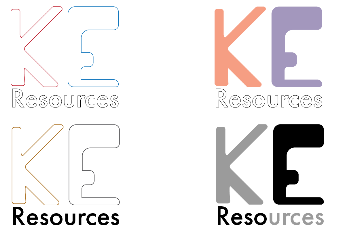
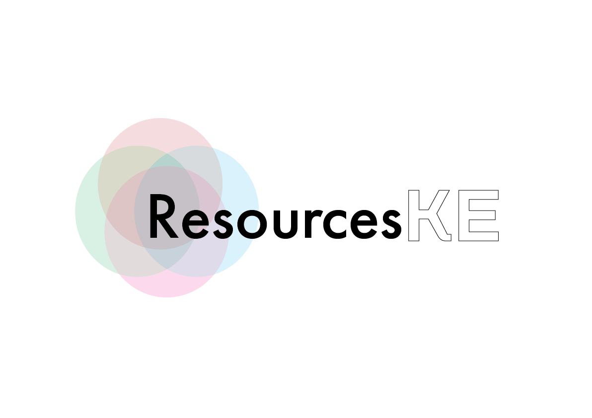
Whilst I was creating initial sketch process, I was looking at the brief to see if I am following to my client's instruction and I saw this image that she attached of how what the learning development process. I was inspired by the formatting of the learning development process and the use of colours to distinguish each step. I used the colours and the shape as well as change the opacity to make it transparent, and layer them on top of the business's name.
Overall I like this idea as I feel it makes the business look mature.
Overall I like this idea as I feel it makes the business look mature.
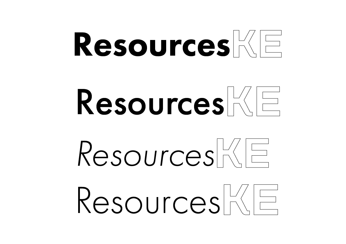
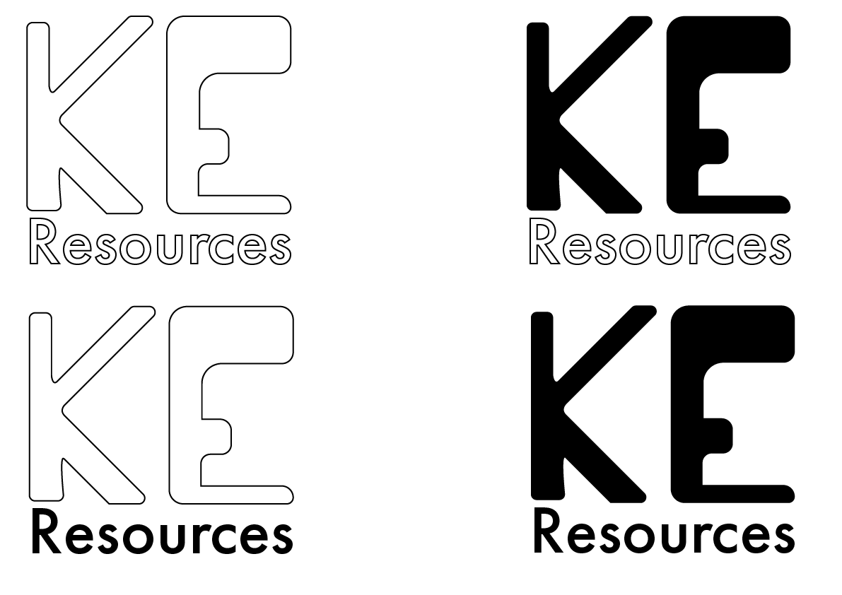
This was more of an experiment as I wanted to emphasise the letters 'KE' however from an outsiders point of view, the viewer would read it as 'KEResources' which fails the brief of the client. As a concept, I do like it and could be worked well, however in a practical point of view, it doesn't work unfortunately.
Client Feedback
After doing these mock-ups of what the logo could be and sent them to the client to see what she thinks.
The clients comments were:
1) The fonts for the logo are good
2) The shapes are good but seems congested
3) The colour selection is nice, not vibrant but pleasing to look at.
This feedback was useful as it helps me understand what the client wants and how she wants her business to be perceived.
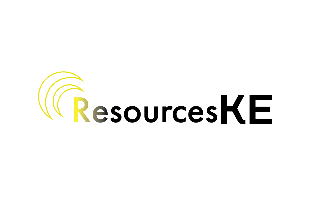
After that feedback, I wanted to expand upon the logo with shapes. I thought about using parts of the outline of the circle and making it more of a subtle detail. After some experimentation I accidently made a crescent moon shape.
I was testing out more placement and thought it was best to place it at the top left of the text.
I showed the client what she thought and she liked the idea. She thought of these shapes to represented as light and shining over the word. So I placed a gradient over the word. I liked it but the yellow to black is off putting but due to idea of light shining over it gave me one more idea to try.
Final Design
After being inspired by the idea of light shining over, that gave me the correlation of the sun and its quite fitting for a business that helps businesses out and a sun is a positive image, representing change and hope.
I created this silhouette of the sun that almost illuminates above the text and felt it was fitting. The client enjoyed it and decided this to be the logo for her new business.