The club wanted to market towards a younger audience and felt as they need to update and modernise their branding to achieve that goal. My job is to try and achieve that goal and satisfy the customer.
Initial Sketches
Their current logo at the time had a tennis ball incorporated in the logo so I wanted to keep that element and primarily make it iconic and consistent compared to the previous logo.
I did my own sketch of a tennis ball and wanted to try and add it to the logo design.
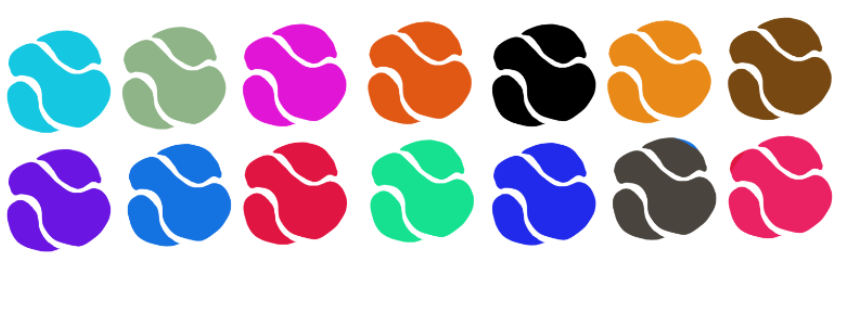
I showed different colours to give the client options and see if he was interested in other colours.
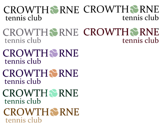
I then used a simple San Serif text and started playing around with the title. I was indecisive where the placement of the phrase 'tennis club' should be on the right hand margin or left and I thought it would be best if I gave the client both options to see what is preferrable to him.

Whilst the client is asked for the colours of hex code: 90B587 as they wanted to keep that specific colour to remain in the new logo and whilst I appealed to the client, I thought it would be best to show different colours as a good logo can be quite versatile in the colours is used.
The colours used were complimentary and pastel like shades as the idea of using vibrant shades would be harsh on the eyes.
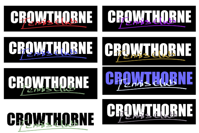
I tried a different a more illustrative approach where I tried adding both still and bold text for the word 'Crowthorne' and do a direct contrast using calligraphy for the phrase ' Tennis Club'.
The client enjoyed this idea however, he wanted the logo to be consistent through: logo, website and merchandising and the calligraphy may not be consistent from a printing onto cloth.
I modified the tennis ball I designed at the start of this project. I drew it using raster pixels rather than vector pixels as it will be difficult to make it different in size however the client at the time liked this design as did I.

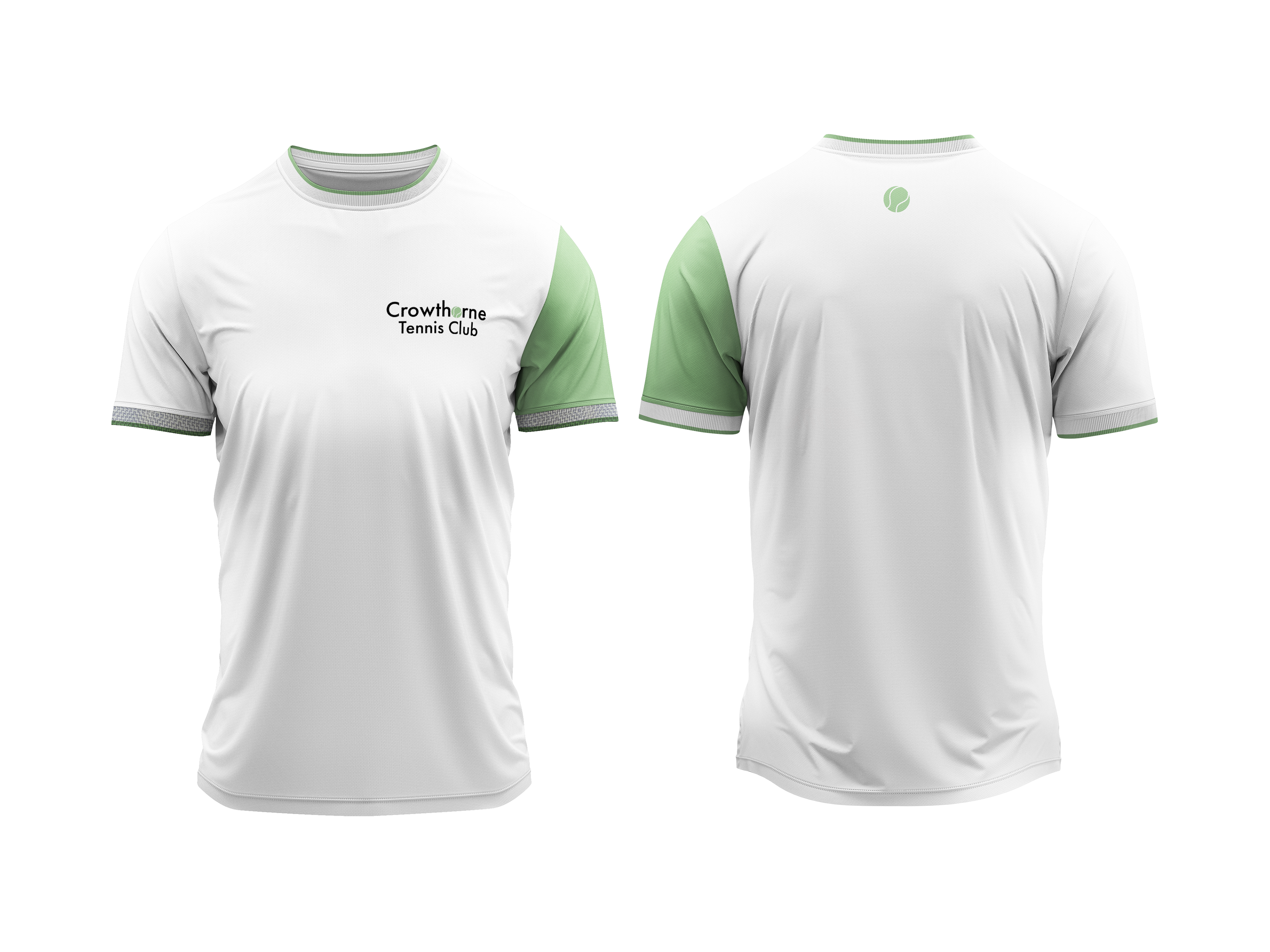
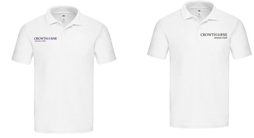
I thought it would be best to show what the logo would look like on a shirt so I created mock-up t-shirt designs. The client was pleased as it was easy to visualise what it would look like on a physical object.
First meeting with client
After showing these initial ideas to the client we had a meeting discussing how to proceed with this project and what the client likes and doesn't like.
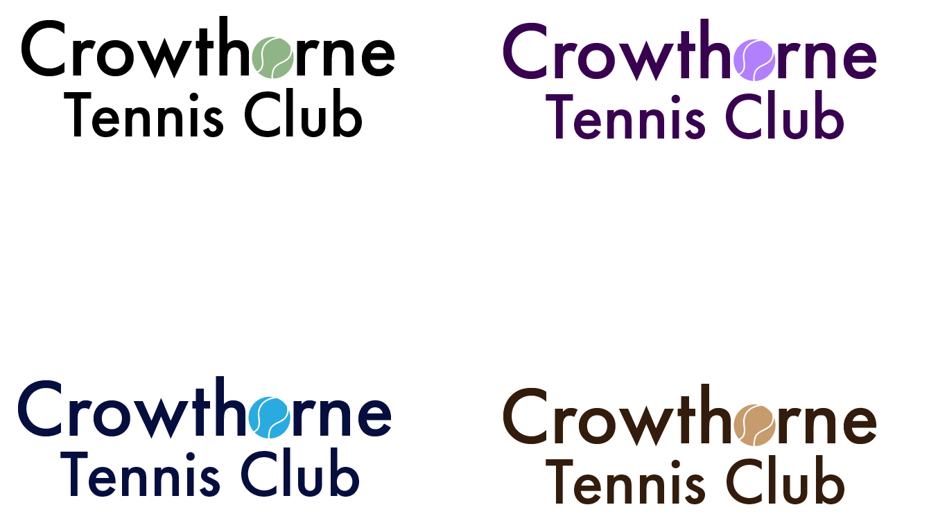
We discussed how we still wanted to use the main colours and use additional colours such as purple, pink, blue and brown because it could be used for different colours on the merchandise, different teams for league matches and for different icons to differentiate different group sessions as the club offers group sessions from kids to adults regardless of skill level.
The client likes the tennis ball and wants that in the logo however it will need to be redone on a different software that uses vector pixels so that the logo can be used in different sizes without losing quality.
The client requested that I would create a figure that is in a middle of doing a tennis action pose. He wants the figure to be gender neutral so it can appeal to anyone without singling any group of people.
Updated Logo
After working on the tennis ball, it was time to improve on the logo.
I wanted to use the ball to replace the 'O' in the word 'Crowthorne'. I was debating whether to replace both 'O's' in the word, however I felt it would too crowded so I stuck with one.
Whilst the client and I decided what colours are wanted, I added three more versions: black, grey and red. The reasons for doing this decision was to show more variety especially with the red as I wanted to see if the client liked using more warmer tones. In conclusion, the client liked the black version of the logo and would want to continue using it. The grey and red version unfortunately weren't as well liked as the others.
Final Design
After doing the committee's feedback, I had adjusted to what they wanted. For each of the colour variation, the text is a darker accent to the corresponding colour instead of solid black.
The client was quite pleased and was happy with this result
I designed some final mock up designs of what some of the merchandise of Crowthorne Tennis Club with the final logo.